
Honeybee — An Original Wordmark for Skaters
Type: Type + Image + Motion
Roe: Student—Cornish College of the Arts, Junior
Timeline: 5 Weeks
During the first semester of Junior year at Cornish College of the Arts, students were asked to develop a part of an original typeface from a six letter word of our choosing and then attribute that word to either an image or motion piece that wasn't directly related to the chosen word.
The word that I based my typeface around was Honeybee that I then attributed to girls that defy stereotypes — specifically skater girls. The project then evolved into more of an overall skating brand with a campaign designed to help promote skating for girls.
YEAR
2016
DELIVERABLES
Type Design
Branding
Photography
Film
Art Direction
TOOLS USED
Photoshop
Illustrator
InDesign
Premiere
Adobe After Effects

HONEYBEE - GIRLS
CAN'T SKATE
Filmed & Directed by Jaden Nethercott
Music: Chow (60) by The Brow
Actors: Dominic Lecouturier, Morgen Quick
Filming Assistant: Janessa Corse
A short campaign video for the skateboarding concept brand, Honeybee, aims to promote female skateboarding. The video begins with a girl receiving a text message from her guy friend asking if she would like to go to the local skate park. She hesitates at first—scared of the judgements of others—but then courageously decides to face her fears and sassily dares anyone to doubt her.
Float Like a Butterfly, Sting Like a Bee.
Honeybee is an original wordmark designed by Jaden Nethercott. It is based on brush strokes that create surprisingly cute letter-forms with sharp edges, which is very reminiscent of a honeybee's soft body and pointed stinger.


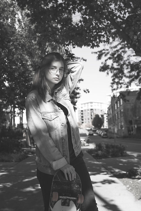
Black & White,
Grunge Imagery
for Honeybee.
For the imagery of Honeybee I wanted it to be very desaturated in order to help the golden overlay of the Honeybee typeface to really pop and to emphasize a black and gold color scheme—like a honeybee. I chose a back alleyway and the local skatepark to help establish the skateboarding aesthetic.


The Project's
Conclusion and Personal Thoughts.
This project helped my love and respect for type grow exponentially.
A particular challenge of the project was not being able to keep the same female model after the initial photoshoot and then neither of the female models being able to truly skate—which lead to some clever editing techniques to help fake it. Another challenge was the design schedule for this whole project, which was five weeks, making it particularly difficult to get the typeface finessed and the images and video shot in time.